Thursday, 28 February 2013

Standard Reader

My target audience for my music magazine will be both male and female aging from around 16-25. I will be slightly biased towards the male gender because they will appeal and relate more to what will feature inside of it. This means that there will be slightly more male artists rather than female artists included in the magazine.

The standard reader for my magazine will be around 18 years of age who spends a lot of time listening to the likes of Odd Future, Kanye West and Jay Z, as well as a variety of all of the the latest charts music. Their mobile phone which is either a BlackBerry or iPhone will be full of albums from different artists, mainly of the Hip Hop and R&B genre. They will spend most of their time listening to this on shuffle whether this may be in school, walking to or from school, in their bedroom or out and about with friends. They enjoy going to festivals and concerts, and interacting with others on things such as fan sites who enjoy listening to the same kind of music. They will also keep up do date with all of the latest trends and dress similarly to their favourite artists as well as having a collection of music magazines including Billboard and NME. 


Thursday, 21 February 2013

Change of Genre - Hip Hop Magazine Style Models

I have changed my magazine's genre from being Chart music to Hip-Hop as I have more knowledge on Hip-Hop and feel I would produce a better product and have more fun if it is themed on Hip-Hop.

When creating my Hip Hop magazine, i will need examples of some current established Hip Hop magazine's that will help me to create mine.

XXL

The first magazine that i will speak about that will help me when creating my magazine is XXL Magazine. XXL is one of the biggest and most popular Hip Hop magazines that caters to everything involving Hip Hop including artists, groups, concerts and videos. The magazine originates from America and the first issue was published in 1997. Every issue has the same house style on its front cover with the XXL logo located in the top left corner. The logo's three capital letters are in white with a red background in order to make it clearly stand out, even if something is covering it. The front cover usually includes one main image of a Hip Hop artist in the center of the page being surrounded by texts explaining what else is included inside of the issue. The magazine features a double paged contents page with the same layout. On the first page at the top is the tag line which says 'The A-Side' and on the second page at the top it says 'The B-Side'. The contents pages follow the same colour scheme of the magazine which is red, white and black as well as various images and contents of what is inside.

Spin

The next magazine that will help me when creating mine is Spin magazine. The Spin magazine has two main genres to it. College-orientated rock music and Hip Hop. It is an American magazine and its first issue was published in 1985. In the past, it has featured artists such as Eminem, Oasis and Odd Future. Very much like XXL Magazine, the Spin logo is almost the exact same. The name of the magazine in capital white text, with a red background/box. These colours are very effective together, hence why they are used by multiple magazines. Like in the majority of magazines, the Spin logo is located in the top left corner of the front cover. The cover includes one main image of an artist in the center surrounded by cover lines that attract peoples attention.

Vibe

Vibe is another music magazine that i will use as an example when creating my Hip Hop themed magazine. Vibe is another American magazine and focuses on the genres of R&B and Hip Hop. Its main competitors are The Source and XXL. Vibe magazine doesn't necessarily have a colour scheme to it, as some of the front covers include colours such as red, blue, orange, yellow, white and black. The logo is located at the top of the magazine and covers it from left to right. Over the years, it has included artists such as Kanye West, Chris Brown and Rihanna.

The Source

The source is another Hip Hop magazine, however rather than just covering music, it also covers politics and culture mainly of America which is where the magazine is from. The first issue of Source was published in 1988, and the magazine has included the likes of Barack Obama, The Game and Kendrick Lamar. It doesn't have a specific colour scheme to it as the front covers alter from colours such as red, white and black. Again, the logo is located at the top of the magazine, and on the majority of issues is the biggest piece of text on the page.

Billboard

Billboard magazine can also help me when creating my magazine as it covers Chart music which can include all kinds of genres of music such as R&B, Pop, Rock and most importantly to me... Hip Hop. The Billboard logo is very creative and features the colours white/black, red, yellow, green and blue. Like most magazines, the logo is located at the top and can be covered by things such as the image of an artist or other text in things such as puffs/pugs. Even with the logo being covered, we would still be able to tell that the magazine is Billboard because it is an established magazine worldwide.


Overall, these five magazines will help me when creating my Hip Hop magazine as they all include my chosen genre. I will be using them as examples in order to help me when designing things such as layouts and house styles to be used in my magazine. Hopefully, i will be able to purchase one of these magazines so that i can annotate it and get a more clear view on how to construct my magazine.

Sunday, 10 February 2013

Questionnaire Results


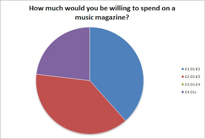
I have recorded the most important answers from my music magazine questionnaire in pie charts as shown above. I believe these are the most important questions as they give me specific information such as how much my audience is willing to spend, and how they normally listen to music. This will help me when creating my magazine as I am now aware of their expectations and needs.

Tuesday, 5 February 2013

Richard Dyer's Star Theory

Richard Dyer's Star Theory states that icons and celebrities are constructed and presented by different institutions in order for a financial gain. They are designed to target and appeal to a specific target audience.

The theory is broken down into three segments. These are:

- Audience and Institutions
- Constructions
- Hegemony/Cultural Beliefs

Audience and Institutions:

The theory says that stars are made in order to make money for a certain purpose.
The institution will then model the stars image around the target audience. Eg. Rhianna, Kanye West


Constructions:

The star is built for a specific audience alone. It is not an actual person. The star will be different and unique to other stars such as Lady GaGa and her outrageous fashion sense.
With the way Danny Dyer has been construced, he is now typecast as a 'hard man' with a cockney accent because of his roles in television with series' and movies such as 'Danny Dyers Deadliest Men' and 'The Football Factory'.


Hegemony:

The star is relatable to the public because they have something to admire or share with them which develops from an admiration to idolization.
The theory can have a really bad affect to it as some people attempt to replicate certain things about their stars that can include taking drugs or alcohol.

Cohen's Moral Panic Theory

Cohen states that the Moral Panic Theory is a condition in which a person or group of people are said to be a threat to society. The threat mainly concerns people in power such as the government, politicians or the media. The theory gets its name from the threat causing a panic amongst the public which turns them into villains in the media. The media refers to these groups as 'folk devils' and makes the public want the government to take charge and control of these groups. An example of this is hooliganism in football with fan firms often being frowned upon and feared by the public due to how they are represented in the media with films such as 'Green Street' and 'The Football Factory'. The BBFC in the UK classifies movies depending on their evil in the media with things such as certificates - 12, 15, 18 etc. Another example of this is how the media such as newspapers have turned the majority of the British public against the likes of immigrants and Muslims because of how they are presented.


Semiotics

Semiotics is the study of signs and symbols. It is the investigation into how meaning is created and used to communicate. The origins of semiotics come from both the visual and linguistic types of signs and symbols to create meaning. Semiotics contains two theorists. Ferdinand de Saussure and Charles Sander Peirce.

The first theorist - Ferdinand de Saussure offered a dydadic approach to semiotics and stated that it is a two-part model of the sign. He defined a sign being composed of two things. A 'signifier' which is the form the sign takes, and the 'signified' which is the concept it represents. Saussure quoted "The sign is the whole that results from the association of the signifier which is signified." Basically, the message that Saussure is getting across is that the sign is made up of something which connotes something else. The signifier is the form which the sign takes, and the signified is the concept it represents. Signification shows the relationship between the signifier and the signified. This is represented in the diagram below. For a linguistic example of this, the word 'Open' (Presented in a shop doorway) is a sign consisting of the signifier being the word open, and the signified being that the shop is open for business.


Charles Sander Peirce's sign theory claimed that there are three main elements. The symbol/symbolic, the icon/iconic and the index/indexical. The symbol is a mode in which the signifier does not resemble the signified, but which is fundamentally arbitrary or purely conventional. This means that the relationship must be learnt. Examples of symbols that Peirce used include general language, numbers, and traffic lights. The icon is a mode in which the signifier is perceived as resembling or imitating the signified such as a painting of a tree, because it is not actually a tree. And finally, the index is a mode in which the signifier is not arbitrary to the signified, but it is directly connected in some way whether this may be physically or casually. An example of this is when you can see footprints. They signify that somebody/something has been walking, however they do not exactly indicate that somebody/something is around at that time to make more footprints.


In order to use semiotics effectively in my music magazine, i will need to make sure that i am referring back to my style model which is Billboard magazine, in order to make sure that i am using the same codes and conventions etc. that would be used in a charts music genre magazine. There is no specific set colour scheme for a charts music genre magazine, which is why i will be following my style model of Billboard magazine in which they use a variety of colours including blue, yellow, black, red etc.


Laura Mulvey's Male Gaze Theory

Gaze is the term referred to when an audience views the people presented in something.

Femenists can be thought of in three different ways. These are:

- How men look at women
- How women look at themselves
- How women look at other women

Laura Mulvey created the term 'Male Gaze' in 1975 and stated that in films, audiences have no other choice but to view the characters in it from the perspective of a hetrosexual male. The camera lingers on features of the female body such as the curves. The events that occur when involving women are presented largely on the mans reaction to it.

The male gaze theory is used in everyday life including the sexualizing of the female body in situations that are completely unnecessary to the context such as when a product is being advertised. A critisicm of the Male Gaze theory is that some women actually enjoy being looked at such as in beauty pageants. The theory can also apply to people of the same gender, not neccessarily in a sexual manner but can be things such as in comparison of body image or in clothing.

Monday, 4 February 2013

Magazine Terminology - Layout

Below are the mock ups/layouts of magazine's such as Heat and Empire. I have done this in order to learn the basic magazine terminology and what is included in magazines.

Sunday, 3 February 2013

GCSE Mag

Below are images of the front cover, contents page and double page spread that i produced for my magazine in GCSE Media Studies. We were allowed to base our magazine on a topic of our choice, I chose to do my magazine on Movies, Music and Video games and called it Reality which i thought was a relevant name towards my magazine and its genre. I chose a colour scheme that featured three colours throughout - Blue, White and Black. Looking at it now, the colours aren't used as effective as they could be. I could have improved it by brightening the magazine up by using colours such as yellow and orange, aswell as using more white. The magazine looks very dark and some of the writing such as the blue text on black background can be hard to read for some people. Especially on the left side of the double page spread. I believe the layout of my front cover looks quite professional and tidy. A clear masthead is established at the top with my magazine's slogan/motto stated underneath. The image used attracts the audiences eye straight away due to the fact that it is the biggest item on the page aswell as being the only image. The image lets the reader know straight away what the magazine is about, and so what it will include. If they don't like what they see, then the magazine won't exactly be for them. In order to use the image as effectively as i did, i had to crop the image (Optimus Prime from the Transformers films) out of an action shot from the film. This involved me going around every part of him using things such as the magic wand tool in Photoshop. To do so, i had to zoom in so i could make it look better. My front cover lets people know what it is inside the magazine. For example, in this one there was an interview, a give away, reviews and articles. I could have improved my contents page and double page spread by again changing the theme and colour code in order to brighten it up aswell as using a more effective and less plain layout so that it looks more professional and of a better standard. Overall, i can't complain as it helped me get an A.


Music Magazine Questionnaire

Here is a link to my music magazine questionnaire that features a selection of questions that will help me in my coursework creating a music magazine front cover, contents page and double page spread.

I would appreciate it if you gave up a moment of your time in order to fill in this questionnaire. All answers submitted will be used and help me along this course.

The results will help me determine such things like how much my magazine will be priced, what age range it will be targetted at, and what sort of things such as pugs i will include on my front cover.


https://docs.google.com/forms/d/1Uuye4Q_6-DME6fEjVDdnOGLX6fmOq7u2rKvEahW8aZY/viewform


Thanks!

Friday, 1 February 2013

Music Magazine Genre's

In the music industry, there are hundreds of different genre's. Some can even be referred to with more than one name. Music magazine's tend to cut these genre's down, and there are not as many. However, there are still tons. Music magazine genre's include:

An example of a music magazine with an R&B theme are the Vibe magazines which feature artists including Kanye West, Usher, Chris Brown, Eminem, Mariah Carey, Beyonce and many more.
The Kerrang! magazine focuses on the rock genre of music and includes bands such as Green day and Biffy Clyro.
The Q Magazine focuses on selection of genre's and artists such as Oasis, Amy Winehouse, Lady Gaga and Jay-Z can be found in it.

The genre i will be choosing for my coursework covers a selection of the ones stated above. It will be on 'Chart music' that includes all of the up and coming, latest and most popular songs and artists in the charts. The charts can include any genre of music, however it tends to mainly feature electronic, rock and pop, rap and hip hop, and r&b and soul types of music. An example of a similar based and very popular magazine are the 'Billboard magazines'. The Billboard brand is built on its exclusive charts and unrivaled reporting on the latest news, issues and trends across all genres of music. It is a very popular and successful magazine that sees thousands of customers every issue. At the end of the course, i hope for my magazine to look of a similarity and professional standard as to that of Billboard magazine.


Above are images of the official Billboard logo that features a very creative colour code, font and style and an example of a Billboard magazine that features American Hip Hop collectives Odd Future (OFWGKTA) from Los Angeles, California on the front of it. Odd Future fall under the genres of Alternative Hip Hop or R&B.

Below is an example of a double page spread and contents page that have been designed for Billboard magazine.


Brief

For the next few months, i will be studying and eventually producing certain pages on a music themed magazine. By the end of the course i will have produced a front cover, contents page and double page spread on a music magazine based upon a music genre of my choice. The genre i will be evolving my magazine around is Charts music which is all about the latest, most popular and up and coming songs and artists in the charts. I have had previous experience creating a magazine front cover, contents page and double page spread from my GCSE work and my magazine had a video game/movies genre. Hopefully by the end of the course, i will be able to tell a clear difference between the GCSE and A-Level work besides the fact that they are of a different genre and theme.

I will also have to complete a prelim task which consists of studying and creating a newsletter for a college/school.