Wednesday 27 March 2013

Annotated Magazine Front Cover & DPS

Below is an annotated front cover from an NME magazine. I have annotated this to give me an idea on how a general front cover is presented.

Saturday 23 March 2013

School Magazine - Prelim Task


These are the photos of the final outcome for my front cover and contents page of my school magazine. As you can see, i have kept the same colour scheme throughout creating the two. The colours used are red, white and blue as they connote the school because they are the colours used on the logo. When creating the magazine, i had altered the layout of it several times as i was not pleased with how it would look. I kept referring back to my mock-ups in order to give me an idea on how to present everything in the house style such as images, text, colours and frames/borders. The front cover of my magazine is actually the third version that i created, however i believed this looked better and more professional than the first and second versions. Overall, i am pleased with the outcome of my school magazine that i have created for the prelim task.

Friday 22 March 2013

School Magazine Front Cover Update


Above is the final version of the front cover for my school magazine. As you can see, the end result looks more professional and effective than the drafts below due to the use of a background image and main article.


Saturday 16 March 2013

Prelim Photos


Here are the photos that i will be using when creating my school magazine for our prelim task. In total, i have 43 images to choose from, however i will not be using all of these. In some cases, it is a matter of deciding which photo i will use out of a set i have took. This can be because the one i eventually end up choosing looks better and more professional than the others. This can be referred to as the trial and error method. I will also have to edit some of the photos on adobe photoshop cs5. This can include changing the brightness of the picture, cropping something out, or even using the clone stamp tool in order to cover something up that i do not want in my picture. The photos are located in a file in my area on the school network so that i can easily access them whenever i want in order to use them in software such as photoshop and microsoft publisher. Overall, i am pleased with the photos that i have taken and believe they will be a good addition to my school magazine.

Wednesday 13 March 2013

Mock Up School Magazine

This is my mock up front cover for my school newsletter magazine. I have used existing newsletters such as the Deyes High and Alsop High newsletters as a guideline to help me to create it and give me ideas. Seen as my magazine will be for Deyes High School, i have decided to stick to the Deyes High colour scheme which consists on the Red, Blue and White. Along the right hand side of my magazine, i will have the Deyes High logo followed by a red square, image, white square, image, blue square and image. This will hopefully give the magazine a unique and professional look. Located at the top of my front cover, i will have the masthead and underneath will be the date and issue number. I am planning to have a main image that covers the whole of my front cover which will resemble the background. I will then add the text on top of the image, however i will need to make sure that i am using the right colours so that the letters are easily visible to the reader and they can be easily read. This will then make my front cover look effective. The image that i am planning on using for my background and covering the front cover is a low angle shot of a football on the school field. This will let the readers know that the school is an active one, and that it take part in extra curricular sport activites such as football. Further images that i am planning to use on my front cover in order to fill space are an image of students eating an apple and drinking water, An image of an exam paper(s) and an image of a selection of books in the school library. All these images will have a topic that is spoke about in the magazine. Whilst making this mock up on microsoft publisher, i used guides which gave me a rough idea on how i was to set everything out. For my front cover, i used the 7x5 guide.


Below is the mock up for my contents page of my school magazine. It roughly follows the same layout as my front cover with the same font and colour scheme. Again, i will have the deyes high logo located in the top right corner next to my 'What's inside:' header to represent the contents page. Below this i will have a brief introduction to the previous and upcoming term at deyes high school. I will then have a box with all of the contents listed. This includes the topic and the page number that they can be found on. Next to this, i will have an image of a sixth form pupil looking smart to give deyes a more academic look. At the bottom of the page i will have three images with page numbers on. These images will be of the outdoor table tennis tables, students walking away from the new/modern building and an image of the school canteen. The images represent differet topics and are used to attract the readers attention. If they like what they see, then they can turn to the page that they are on.


Tuesday 12 March 2013

Alsop High School Newsletter

The newsletter follows a black and white colour scheme, however there is some use of colour such as blue hyperlinks, and at the bottom of the newsletter where there are logo's of the schools associates and affiliates such as the Recognition of Quality and Hmmm exciting minds logos.

The newsletter keeps the same formal font throughout to show that it is a formal piece of text that is also professional. The titles of the different topics are in bold print and underlined to let the reader know what the topic is and that the subject has changed. Again, it also shows that it is professional in order to give the school a good reputation.

In this particular newsletter, there is only one page. This may be because they will have recently released another newsletter that covers all of the current topics at the school and so in this current edition of the newsletter, there is not much new news that needs to be talked about. This is more of an informative article that just talks about the latest and necessary topics as well as giving a brief description of them.

The house style of the newsletter is presented with four boxes at the top of the page. One containing the masthead being the biggest sized font at the very top of the page as well as the schools logo. This is done so that soon as someone glances at it, they will know exactly what it is, which is exactly what it says - 'Alsop High School Newsletter'. Two boxes are then placed underneath this in order to give the newsletter a very professional look to it. One of the boxes includes the date for the issue of the newsletter (8th March 2013) as well as the only image on the page, (With the exception of logo's) which is an image of the school. I am assuming that the image that they have used of the school is of the latest building to be designed as it looks of a high standard. This will then make the reader assume that the school and newsletter is also of a high standard as it has a very modern look to it. The box next to this is a message from the headteacher of the school which opens the newsletter and shows the reader that they are very much so involved with everything the school does such as the newsletter. The final box used is a useful addition for both students and parents because it is a 'Dates for your diary' section which they will take note of if it involves them/their son/daughter.

The information is presented in short paragraphs in order to keep the readers attention. If someone was to look at the newsletter and just see a big paragraph of words with no breaks or paragraphs, they will not bother reading it, as they will get bored due to the fact that it is not very appealing. Overall, i believe Alsop have done a very good job when designing their newsletter as it has a very good look to it, and keeps up with the high, professional standards of the school. The newsletter definitely meets its target audience of older students and parents as it sticks to its formal house-style and layout. 

Here is the current newsletter as of April 26th.

Deyes High Newsletter

The newsletter is colour coded and follows a five coloured theme throughout. The colours used are White, Red, Blue, Black and Yellow. The colours used match the Deyes High School logo to show that it is official and makes it look professional. Colours such as Yellow are used to brighten up the newsletter and appeal to a younger audience such as the younger pupils of the school.

The same font is used throughout to show that the newsletter is professional. The font used also shows levels of formality and the titles are in bold print to let the reader know what the topic is about. Again, using the same font throughout shows the professionalsim of the newsletter, however some people could argue that it could be better in some cases to use different fonts to show a range.

Images are also used throughout the newsletter to attract and appeal to an audience. The images used include a picture of the headteacher, a drama teacher, drama students, an image of Mo Farah related to the quote on a topic, and an image of Mickey Mouse in the 'Numeracy Top Tip' section of the newsletter. An advertisement is also used on the back of the newsletter to promote a school play that the schopol are producing. The advertisement includes an image of Freddie Mercury, The Deyes High School Logo and the Curtain Call Productions logo.

Puzzles are used in the newsletter to entertain the readers - Primarily younger readers who are looking to do something. The Puzzles are another way in which the editor has brightened the newsletter up.

The Deyes High School logo and name are used at the top of the newsletter to show that it is offical and proffesional. They have also used a slogan that creatively links to the school's name that states: 'The Deyes of our life - Weekly News.' They have spelt the word Days as Deyes which is a pun.

The newsletter is presented in paragraphs in order to separate the text so that the reader does not get bored reading and so they will carry on. Paragraphs give the readers eyes and brain time to digest what has been written and are verry effective.


Saturday 9 March 2013

Ideology

Ideology refers to the ideas behind a media text. It can be a body of ideas or set of beliefs that underpins either a process or institution and leads to social relations. The set of beliefs are those held by groups within society, and the prevalent ones are those held by the dominant groups. It is important to have an ideology because it gives an idea on what is going to be used including things such as images, texts, fonts and colour schemes which all relate to the house style of a magazine. 

When it comes to designing my newsletter, I will be getting across the fact that Deyes is a specialist science school. I could do this by perhaps including pictures of a student or group of students carrying out a science practical experiment. In this shot, I would make sure that it includes props such as a lab coat, goggles, test tubes and many more.

I would also promote the healthy eating programme that the school currently has. I would do this by including an image of a group of students with things such as bottles of water and apples etc. I could also do it being quite subtle by simply making sure that the students pictured are not carrying sugary items such as bottles of lucozades and chocolate bars. This could also show the different partnerships with food companies that the school currently has such as the school's current food supplier 'Mojo'.

Another ideology factor that I could show in my school newsletter is including the extra curricular activities that the school carry out such as after school football and tennis clubs etc... This shows the hard work that the teachers and pupils put in out of school hours. This will also show the achievements and rewards that the school have been awarded. I will show this by using images that I have taken of things such as a low angle shot of a football on the school field, or a sports team in a team photo. Another image that I have taken in preparation of my prelim task is of the latest addition to the school which is of the outdoor table tennis tables. I have a variety of shots of these, including action shots, low angle shots, over the shoulder shots and many more.

Another ideology factor that I could include in my school magazine is of the excellent range of books available in the schools library. This can show the latest additions to the LRC (Learning Resource Center) as well as the wide range they have on offer in order to cater the needs of the pupils. In order to make this ideology factor effective, i could perhaps take a low angle shot of some of the book stands because this would look very professional and I feel as though it can relate perfectly to my school magazine and the topics that it would include.

Friday 8 March 2013

Photoshop Edits

The below screenshots show the processes of me using some of the tools available to use on Adobe Photoshop. These will help me when designing my music magazine as it allows me to get to grip with the basic tools so that i am familiar with the software.


Above are the before and after screen-shot of a very basic tool on Adobe Photoshop CS5. The tool is the crop tool and allows me to cut out and get rid of a part of an image that i do not want. 


These two screenshots show how I have adjusted a picture of a rugby team warming up by changing the 'curves' of the photo. This has allowed me to make the photo look more clear and of a higher quality due to the brightness increasing.


 These three screenshots above show how i have used the 'black and white' tool in order to make part of the photo black and white whilst keeping some of it in colour. To do so, i had to use the quick select tool and highlight the part of the picture that i wanted to keep in colour which was the mirror. I then selected the remaining parts of the image and changed that to black and white, whilst keeping the mirror which i had selected in colour.


 The above screenshots show how i have used the 'clone stamp' tool in order to get rid of part of an image which i do not want. As you can see, i wanted to get rid of all of the bottles except the 'Chilli beer'. To do this, i had to grab a part of the background (trees) to be blended in and simply go over the bottles that i do not want. This process requires a lot of time and patience in order to make the photo look as professional as possible.


These two screenshots show the before and after photos of me carrying out the 'spot heal' process. The spot healing tool is used to get rid of things such as spots on peoples' faces, or the spots on dalmatian dogs which i have done. In order to make the photo look as if it it has not been edited and that the spots weren't there, the spot healer needs to be the same size of the spot and then the user simply clicks over it to get rid of it. If this is not done correctly, it can be easy to tell that the photo has been altered with as there are rough patches to it.

Hip-Hop Mood Board


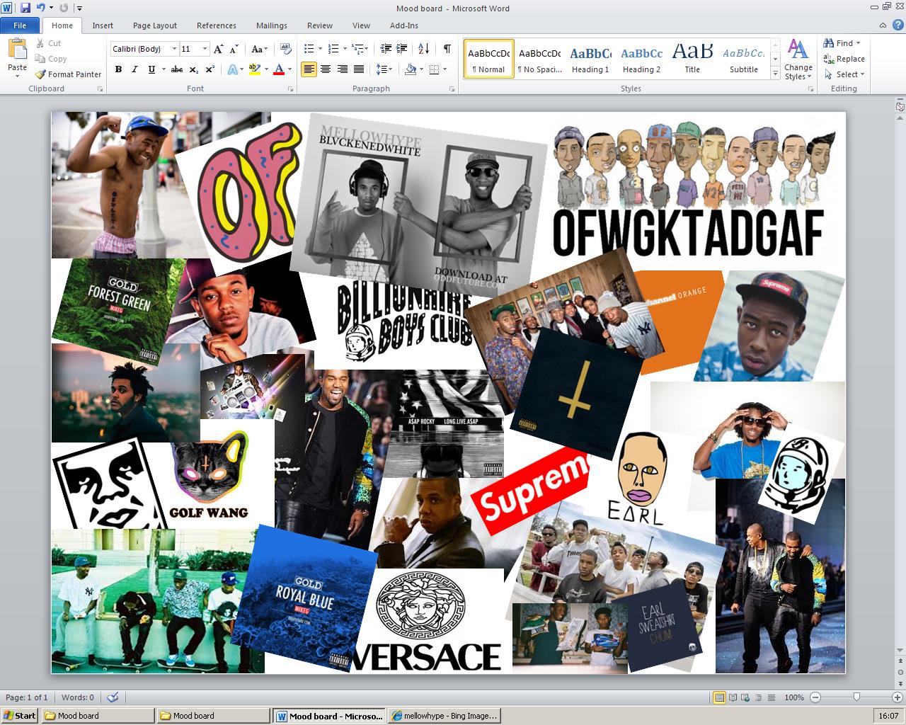
This is the mood board that i have created for the Hip-Hop music genre. Without knowing what genre the mood board was, you would automatically be able to tell that it is Hip-Hop due to the connotations linked to the genre such as the the logos and CD Covers i have included. The mood board consists of artists, groups, logo's and CD Cover art's all associated to Hip-Hop. Overall, i believe i have done a very effective job on creating my mood board, and am pleased with the outcome.

Tuesday 5 March 2013

Mind Map


This is the mind map that i have created in order to help me design my music magazine. I have included artists associated with my chosen genre of Hip-Hop so that i have an idea on their personalities and what type of artists i should include in my magazine. I have included connotations to the Hip-Hop genre in order to give me an idea on potential names for my magazine. The potential names that i have came up with so far are Cloud, Explicit, Supreme, Evolution, Now or F/Phresh. I will most likely either use Explicit or Supreme as i believe they sound and will look good when presented. I am still thinking of names for my magazine, so none of the ones above are deffinately going to be used. On the mind map, i have also included colours that are associated with the Hip-Hop genre and my target audience which is older teenagers aging from 16-25.