Wednesday, 24 April 2013
Evaluation Question 1
I have included different Hip-Hop songs to play in the background of my prezi presentations to sum up the genre and the course that I have completed. The artists who's songs feature include Kanye West, Kendrick Lamar, Mike G and even a Ministry of Sound Hip-Hop album mixtape.
My Final Double Page Spread
When creating my double page spread, I changed a few things on it in order for it to look more effective. In the final version as pictured below, I have added a byline and cleared up my artist's skin with the spot healing tool to make it look more presentable and professional.


My Final Magazine Contents Page
After the reviews and opinions that I received on my contents page, I found out that I did not need to make many changes. The only change I had to make was making sure the page numbers go up in sequential order rather than randomly.


My Final Magazine Front Cover
After giving my magazine to a group of class mates who enjoy listening to the Hip-Hop genre, I had noticed that I needed to make a few alterations in order for it to look better and appeal to them more. I had to add things such as a new slogan, drop shadow on texts and a footer.


When they seen the improved version (as pictured below) they thought it looked great and much better than the first version. Overall, i am pleased with the outcome.

Sunday, 21 April 2013
Magazine Double Page Spread Draft
Below is the first draft for my double page spread.

I then went on to create a second draft as I changed the lay out by separating my two boxes and adding a by line.

I then went on to clear my artists skin with the spot healing brush which then gave me my final product.
Friday, 19 April 2013
Magazine Contents Page Draft
Below is the first draft of the contents page for my magazine. I made a mistake by putting my page numbers in a random order which I then had to change to give me my final product.


Magazine Front Cover Draft
Below is the first draft of my music magazine front cover.


I then went on to do some changes such as changing my slogan, adding drop shadow to texts, increasing the price and adding a footer to the bottom. However, I didn't relise that I had mentioned an artist (Pharrell) as a cover line and in the footer which I then had to change to give me my final product.

Thursday, 18 April 2013
Magazine Photo's
Below are the photo's that I have taken to be used in my magazine. I have taken two different photo shoot's as I did not like the original photo shoot that I did at night due to things such as red-eye. I then went on to find another artist to be used in my magazine and took much better photo's in the day time. Overall, the second photo shoot was very effective and I have taken some great pictures that will make my magazine look as professional as it can be.


Tuesday, 16 April 2013
Risk Assessment Form
Below is the risk assessment form that I have filled in that highlights the risks that will be taken when carrying out the photo-shoot for my magazine.


Contributor's Release Form
Below is the contributor's release form that has been filled in and signed by both me and the artist who will model for the photo-shoot for my magazine.


Saturday, 13 April 2013
Music Magazine Mock-Up's
Below are the mock up's that I have created to help me and give me an idea on how I want to lay my magazine out. When designing my magazine, I will keep refering back to my mock-ups in order to know what looks effective and how to set it out.


Monday, 8 April 2013
Magazine Title Evaluations
H-Squared² - The first magazine title that i have in mind is H-Squared². This stands for my chosen genre which is Hip Hop. Hopefully the reader will gather this and then they can easily decide whether or not the magazine is for them. I can also abbreviate the title to just H² in order to make it look more effective, however this may be too short and small for a magazine title and can so make the end product look unprofessional and of a low standard. I believe this would be a good name for my magazine as it is very unique and has the potential to become a catchy and established title.
 Supreme - The next magazine title that i will be evaluating will be Supreme. I initially came up with this title from the popular Hip Hop related clothing line Supreme that is worn by a lot of the artists that i will be including in my magazine. Straight away it has a link to the magazine through fashion and trend, however i also believe that it would look very effective as a magazine title with the red and white colour scheme that Supreme already has. It could also build a partnership with the clothing line and be the official music magazine which will gain the magazine tons of publicity. This will also come in handy as a lot of the publicity that it will gain will already be Hip Hop/Alternative Hip Hop music fans.
 Faded - Another magazine title that i will be choosing between is Faded. I really like this title as i believe it would sound and look good being a Hip Hop magazine title. I got the idea for the title as Faded is a common word that Hip Hop artists use in their songs. The actual definition of Faded is to gradually grow faint and disappear or to lose colour/brightness. This can then link to the colour scheme that i would use. I would use colours that relate to the meaning such as black, grey and white which all look very effective when used together as text can be easily read. Faded has many urban uses to it such as to describe something as being high/stoned/blazed, tired as fuck or getting revenge. All of these urban uses to the word can relate well to my target audience as a i believe they will regularly use them, much like their favourite artists. Another reason why i really like the title Faded is because of the straight edge on the capital letter 'F'. I intend to include the word 'magazine' inside the letter 'F' on its side so that the magazine can also be referred to as Faded Magazine. I have seen this done on a few magazine's and it looks very professional.
 Explicit - The fourth magazine title that i have in mind is Explicit. I originally got this idea as it relates to the 'Explicit content' notice found on most Hip Hop CD/Album covers in order to inform that parental discretion is advised. Explicit is when an exact equivalent of something is defined. This will link to my target audience as the majority of them will prefer the Explicit version of songs/videos rather than the clean version as they will include things such as swear words, and sexual/graphic content that the clean version does not. This tells us that the audience is somewhat rebellious which is exactly what i want them to be as it relates to the Hip Hop genre. Like Faded, Explicit has a straight edge to the letter 'E' that allows me to include the word 'magazine' in it in order for me to make it look more professional and effective. This also links to one of the tag lines that i have in mind which is 'Parental Advisory. Explicit Content'. Again, this will make the magazine look more professional.

Overall, i believe my final decision is most likely going to be Faded as i think this will be a better match to my magazine rather than the other title ideas. I will also be using the tag line 'We put the Hip in Hip-Hop' as this is very catchy and will look very professional when presented on my magazine.


Overall, i believe my final decision is most likely going to be Faded as i think this will be a better match to my magazine rather than the other title ideas. I will also be using the tag line 'We put the Hip in Hip-Hop' as this is very catchy and will look very professional when presented on my magazine.
Saturday, 6 April 2013
My Target Audience Considerations
Qualities of target audience you want to reflect:
The main quality that my target audience will possess will to be up to date on all of the latest music and fashion. Preferably related to Hip Hop, however they will have a good knowledge on other genre related fashions. This means that they will have a good dress sense and will be street smart. They will be aged from around 16-25 and be very modernised, adapting themselves to current trends and habbits. As well as the main genre being Hip Hop, they also love to listen to sub genres such as Rap, R&B and Alternative Hip Hop/Rap.
Aspirations of your target audience:
The aspirations of my target audience will be to follow in the footsteps of some of their favourite artists. This will include trying to be the best, having a large group of friends and being able to stand out in a crowd by being unique and having a good personality.
Feature ideas:
My magazine will feature all of the latest news and gossip surrounding the Hip Hop genre and its artists. The artists that will feature in my magazine will include Odd Future (Tyler, Earl, Mike, Frank etc.), Kendrick Lamar, ASAP Rocky, Kanye West, Jay Z, Pharrell and many more.
Regular ideas:
I will be including regular ideas in my magazine such as reviews, interviews and articles on all of the latest news regarding the Hip Hop genre. I will also include things such as competitions and upcoming events that my audience can relate to and be informed on.
Magazine Name(s) and Qualifier:
Explicit, Supreme, H-Squared² or Faded.
- We put the Hip in Hip-Hop.
- Parental Advisory. Explicit Content.
Friday, 5 April 2013
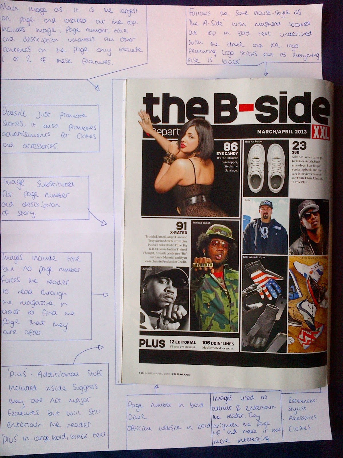
XXL Magazine March/April 2013


Below are the annotated front cover, contents pages and a double page spread of the biggest Hip Hop magazine about - XXL. The issue that i have annotated is the March/April 2013 issue, which is the most recent one. I will also be annotating the December/January 2012 issue of XXL Magazine to compare the two and see if and how the house style has stayed the same or changed. This will also give me more knowledge and guidance when creating the front cover, contents page and double page spread for my magazine - Faded. As you can see, the XXL contents page has a very strange layout. There are two parts separated by advertisements. The second page even contains contents and page numbers that are before some of the ones on the first page. Therefore, it is not in chronological order which can confuse some readers.


Tuesday, 2 April 2013
NME Magazine Annotated
Below are the annotated pages of an NME Magazine . I have annotated the front cover, the contents page and two double page spreads. I chose to annotate this issue of NME Magazine as the main article is about a Hip Hop artist who i will be featuring inside my magazine. Therefore, it will relate to my chosen genre of Hip Hop and help me out when creating my magazine. I will also be annotating two issues of the biggest Hip Hop magazine XXL.


Wednesday, 27 March 2013
Annotated Magazine Front Cover & DPS
Below is an annotated front cover from an NME magazine. I have annotated this to give me an idea on how a general front cover is presented.


Saturday, 23 March 2013
School Magazine - Prelim Task


These are the photos of the final outcome for my front cover and contents page of my school magazine. As you can see, i have kept the same colour scheme throughout creating the two. The colours used are red, white and blue as they connote the school because they are the colours used on the logo. When creating the magazine, i had altered the layout of it several times as i was not pleased with how it would look. I kept referring back to my mock-ups in order to give me an idea on how to present everything in the house style such as images, text, colours and frames/borders. The front cover of my magazine is actually the third version that i created, however i believed this looked better and more professional than the first and second versions. Overall, i am pleased with the outcome of my school magazine that i have created for the prelim task.
Friday, 22 March 2013
School Magazine Front Cover Update

Above is the final version of the front cover for my school magazine. As you can see, the end result looks more professional and effective than the drafts below due to the use of a background image and main article.


Saturday, 16 March 2013
Prelim Photos

Wednesday, 13 March 2013
Mock Up School Magazine
This is my mock up front cover for my school newsletter magazine. I have used existing newsletters such as the Deyes High and Alsop High newsletters as a guideline to help me to create it and give me ideas. Seen as my magazine will be for Deyes High School, i have decided to stick to the Deyes High colour scheme which consists on the Red, Blue and White. Along the right hand side of my magazine, i will have the Deyes High logo followed by a red square, image, white square, image, blue square and image. This will hopefully give the magazine a unique and professional look. Located at the top of my front cover, i will have the masthead and underneath will be the date and issue number. I am planning to have a main image that covers the whole of my front cover which will resemble the background. I will then add the text on top of the image, however i will need to make sure that i am using the right colours so that the letters are easily visible to the reader and they can be easily read. This will then make my front cover look effective. The image that i am planning on using for my background and covering the front cover is a low angle shot of a football on the school field. This will let the readers know that the school is an active one, and that it take part in extra curricular sport activites such as football. Further images that i am planning to use on my front cover in order to fill space are an image of students eating an apple and drinking water, An image of an exam paper(s) and an image of a selection of books in the school library. All these images will have a topic that is spoke about in the magazine. Whilst making this mock up on microsoft publisher, i used guides which gave me a rough idea on how i was to set everything out. For my front cover, i used the 7x5 guide.

Below is the mock up for my contents page of my school magazine. It roughly follows the same layout as my front cover with the same font and colour scheme. Again, i will have the deyes high logo located in the top right corner next to my 'What's inside:' header to represent the contents page. Below this i will have a brief introduction to the previous and upcoming term at deyes high school. I will then have a box with all of the contents listed. This includes the topic and the page number that they can be found on. Next to this, i will have an image of a sixth form pupil looking smart to give deyes a more academic look. At the bottom of the page i will have three images with page numbers on. These images will be of the outdoor table tennis tables, students walking away from the new/modern building and an image of the school canteen. The images represent differet topics and are used to attract the readers attention. If they like what they see, then they can turn to the page that they are on.

Tuesday, 12 March 2013
Alsop High School Newsletter
The newsletter follows a black and white colour scheme, however there is some use of colour such as blue hyperlinks, and at the bottom of the newsletter where there are logo's of the schools associates and affiliates such as the Recognition of Quality and Hmmm exciting minds logos.
The newsletter keeps the same formal font throughout to show that it is a formal piece of text that is also professional. The titles of the different topics are in bold print and underlined to let the reader know what the topic is and that the subject has changed. Again, it also shows that it is professional in order to give the school a good reputation.
In this particular newsletter, there is only one page. This may be because they will have recently released another newsletter that covers all of the current topics at the school and so in this current edition of the newsletter, there is not much new news that needs to be talked about. This is more of an informative article that just talks about the latest and necessary topics as well as giving a brief description of them.
The house style of the newsletter is presented with four boxes at the top of the page. One containing the masthead being the biggest sized font at the very top of the page as well as the schools logo. This is done so that soon as someone glances at it, they will know exactly what it is, which is exactly what it says - 'Alsop High School Newsletter'. Two boxes are then placed underneath this in order to give the newsletter a very professional look to it. One of the boxes includes the date for the issue of the newsletter (8th March 2013) as well as the only image on the page, (With the exception of logo's) which is an image of the school. I am assuming that the image that they have used of the school is of the latest building to be designed as it looks of a high standard. This will then make the reader assume that the school and newsletter is also of a high standard as it has a very modern look to it. The box next to this is a message from the headteacher of the school which opens the newsletter and shows the reader that they are very much so involved with everything the school does such as the newsletter. The final box used is a useful addition for both students and parents because it is a 'Dates for your diary' section which they will take note of if it involves them/their son/daughter.
The information is presented in short paragraphs in order to keep the readers attention. If someone was to look at the newsletter and just see a big paragraph of words with no breaks or paragraphs, they will not bother reading it, as they will get bored due to the fact that it is not very appealing. Overall, i believe Alsop have done a very good job when designing their newsletter as it has a very good look to it, and keeps up with the high, professional standards of the school. The newsletter definitely meets its target audience of older students and parents as it sticks to its formal house-style and layout.

Here is the current newsletter as of April 26th.
Deyes High Newsletter
The newsletter is colour coded and follows a five coloured theme throughout. The colours used are White, Red, Blue, Black and Yellow. The colours used match the Deyes High School logo to show that it is official and makes it look professional. Colours such as Yellow are used to brighten up the newsletter and appeal to a younger audience such as the younger pupils of the school.
The same font is used throughout to show that the newsletter is professional. The font used also shows levels of formality and the titles are in bold print to let the reader know what the topic is about. Again, using the same font throughout shows the professionalsim of the newsletter, however some people could argue that it could be better in some cases to use different fonts to show a range.
Images are also used throughout the newsletter to attract and appeal to an audience. The images used include a picture of the headteacher, a drama teacher, drama students, an image of Mo Farah related to the quote on a topic, and an image of Mickey Mouse in the 'Numeracy Top Tip' section of the newsletter. An advertisement is also used on the back of the newsletter to promote a school play that the schopol are producing. The advertisement includes an image of Freddie Mercury, The Deyes High School Logo and the Curtain Call Productions logo.
Puzzles are used in the newsletter to entertain the readers - Primarily younger readers who are looking to do something. The Puzzles are another way in which the editor has brightened the newsletter up.
The Deyes High School logo and name are used at the top of the newsletter to show that it is offical and proffesional. They have also used a slogan that creatively links to the school's name that states: 'The Deyes of our life - Weekly News.' They have spelt the word Days as Deyes which is a pun.
The newsletter is presented in paragraphs in order to separate the text so that the reader does not get bored reading and so they will carry on. Paragraphs give the readers eyes and brain time to digest what has been written and are verry effective.
Saturday, 9 March 2013
Ideology
Ideology refers to the ideas behind a media text. It can be a body of ideas or set of beliefs that underpins either a process or institution and leads to social relations. The set of beliefs are those held by groups within society, and the prevalent ones are those held by the dominant groups. It is important to have an ideology because it gives an idea on what is going to be used including things such as images, texts, fonts and colour schemes which all relate to the house style of a magazine.
When it comes to designing my newsletter, I will be getting across the fact that Deyes is a specialist science school. I could do this by perhaps including pictures of a student or group of students carrying out a science practical experiment. In this shot, I would make sure that it includes props such as a lab coat, goggles, test tubes and many more.
I would also promote the healthy eating programme that the school currently has. I would do this by including an image of a group of students with things such as bottles of water and apples etc. I could also do it being quite subtle by simply making sure that the students pictured are not carrying sugary items such as bottles of lucozades and chocolate bars. This could also show the different partnerships with food companies that the school currently has such as the school's current food supplier 'Mojo'.
Another ideology factor that I could show in my school newsletter is including the extra curricular activities that the school carry out such as after school football and tennis clubs etc... This shows the hard work that the teachers and pupils put in out of school hours. This will also show the achievements and rewards that the school have been awarded. I will show this by using images that I have taken of things such as a low angle shot of a football on the school field, or a sports team in a team photo. Another image that I have taken in preparation of my prelim task is of the latest addition to the school which is of the outdoor table tennis tables. I have a variety of shots of these, including action shots, low angle shots, over the shoulder shots and many more.
Another ideology factor that I could include in my school magazine is of the excellent range of books available in the schools library. This can show the latest additions to the LRC (Learning Resource Center) as well as the wide range they have on offer in order to cater the needs of the pupils. In order to make this ideology factor effective, i could perhaps take a low angle shot of some of the book stands because this would look very professional and I feel as though it can relate perfectly to my school magazine and the topics that it would include.
Friday, 8 March 2013
Photoshop Edits
The below screenshots show the processes of me using some of the tools available to use on Adobe Photoshop. These will help me when designing my music magazine as it allows me to get to grip with the basic tools so that i am familiar with the software.


Above are the before and after screen-shot of a very basic tool on Adobe Photoshop CS5. The tool is the crop tool and allows me to cut out and get rid of a part of an image that i do not want.


These two screenshots show how I have adjusted a picture of a rugby team warming up by changing the 'curves' of the photo. This has allowed me to make the photo look more clear and of a higher quality due to the brightness increasing.


These three screenshots above show how i have used the 'black and white' tool in order to make part of the photo black and white whilst keeping some of it in colour. To do so, i had to use the quick select tool and highlight the part of the picture that i wanted to keep in colour which was the mirror. I then selected the remaining parts of the image and changed that to black and white, whilst keeping the mirror which i had selected in colour.


The above screenshots show how i have used the 'clone stamp' tool in order to get rid of part of an image which i do not want. As you can see, i wanted to get rid of all of the bottles except the 'Chilli beer'. To do this, i had to grab a part of the background (trees) to be blended in and simply go over the bottles that i do not want. This process requires a lot of time and patience in order to make the photo look as professional as possible.


These two screenshots show the before and after photos of me carrying out the 'spot heal' process. The spot healing tool is used to get rid of things such as spots on peoples' faces, or the spots on dalmatian dogs which i have done. In order to make the photo look as if it it has not been edited and that the spots weren't there, the spot healer needs to be the same size of the spot and then the user simply clicks over it to get rid of it. If this is not done correctly, it can be easy to tell that the photo has been altered with as there are rough patches to it.
Subscribe to:
Posts (Atom)